Friday 8 April 2011

Conventions

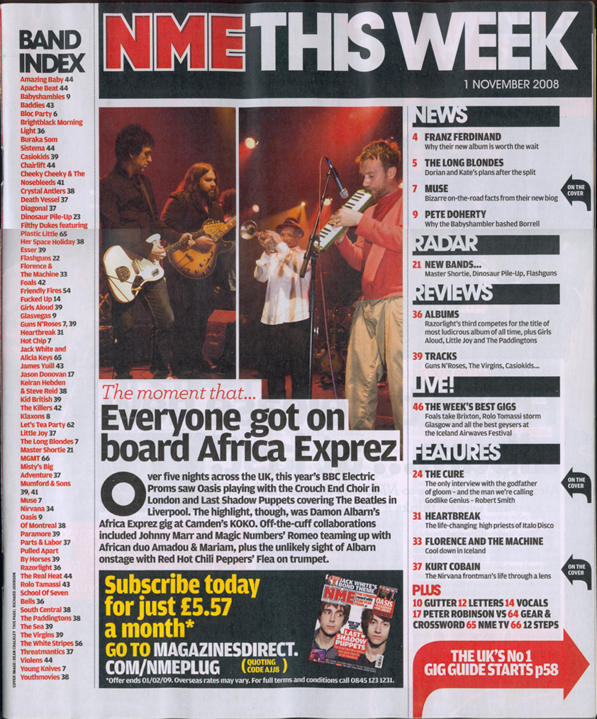
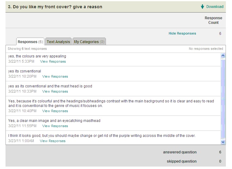
Conventions of a front page are a bold clear masthead that stands out to the target audience that is easy to read and eye catching. It also should be a bright bold colour making it clear to the audience. A main image that dominates the front page relating to the coverlines and main features on the page. A consisten colour scheme should be used throughout to make sure it attracts the audiences attention. Coverlines should be used to tell the audience what is featured in the magazine. A barcode, date and price should be added to make the magazine more realistic and proffessional.

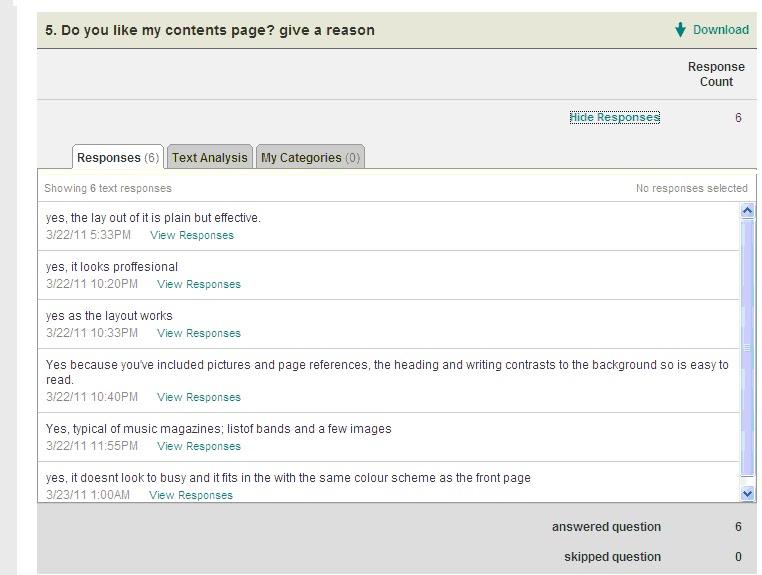
Conventions of a Contents page are a clear masthead showing what the page will consist of. A main features list showing what artists and other features are shown within the magazine. Clear use of images from the artists featured in the magazine. Page numbers telling you what features are where. A large clear, dominant font used to attract audiences attention. Use of continous colour scheme that attracts audience attention.

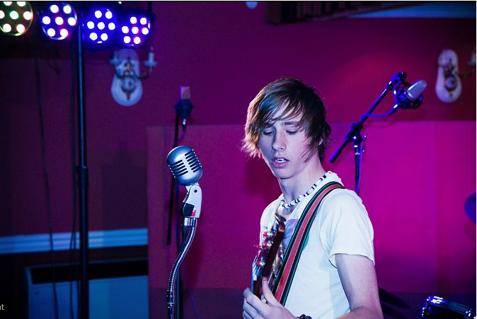
Conventions of a Double page spread are images showing the band. A factfile on the band that is featured in the double page spread. Pull quotes from the text. A main masthead stating who the band is that is featured. Again the use of the same colour scheme throughout. Article put into columns with a clear font. Page numbers at the bottom of the page to make it looks proffesionally.
 
My front cover is conventional as i have a clear main masthead that shows my the name of my magazine 'Pulse' clearly. I also have many  coverlines that tell the audience what the magazine will feature attracting their attention. The coverlines are a different colour to the masthead and main coverline to allows the masthead and maing coverline to stand out more and attract the audiences attention. The front cover also has a price, date and barcode which gives it a proffesional finish to make the magazine look more realistic. The main image used fills most of the page which is conventional. It also shows an Indie looking character with a checkered shirt, headphones and an Indie style haircut so that the main image fits the theme and genre of the magazine. I also added a logo to the front cover to show that my magazine is part of an institution giving it more of a proffesional feel to it. I also added exclusive offers such as 'album samplers to make them more interested in the magazine. I used a black, white and purple colour scheme throughout the magazine to make it consistent and seem proffesional and realistic. I also used Sans Serif fonts to make it easy on the eyes of the audience creating an Indie feel to my magazine as its laid back. My front cover follows the principle of thirds as the hotspots on the page are the main coverlines and main image as they are the most important memorable thing. The route of the eye goes from the masthead, to the main image, to the coverlines, to the main coverline and then down across the other main features.

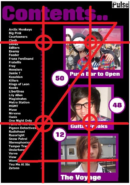
My Contents page is conventional as it has a clear main masthead saying that it is the contents page. It uses the same colour scheme as the front cover also to create a proffesional look. It has images that relate to the articles shown, the images also show conventions of being Indie through the use of props and the costume used. It has a clear list of what bands and features are shown in the magazine to allow the audience to find things easier. It also shows the audience what page numbers they appear on. The masthead text is of a different font to the rest of the page to make it stand out more, Sans serif  fonts are used to make it easier to read. The page is also very ordered and non scattered which makes it easier for the audience to understand the page. I also added the Pulse masthead in the right hand corner again to make the page more proffesional and catch the eye of the audience. My contents page follows the principle of thirds rule as the hotspots are the images showing the bands, and the text on the left hand side telling you what is featured. The route of the eye shows what the page is about, then the images, and then finally the page numbers and main features.


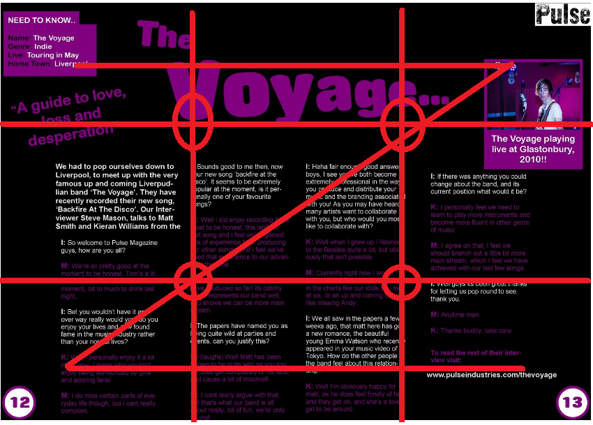
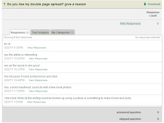
My Double page spread is conventional as it has again a clear masthead which grabs the audiences attention and tells you what the main article is about. I also put the main article into paragraphs so its easier to read and more proffesional. I added an image of the featured band to make it more appealing and appropriate. i added a pull quote to make it again more appealing. I added a fact file to make it more proffesional. I used the same house style and colour scheme throughout again so it made it more proffesionally and appealing for the audience to view. Different fonts are used between the masthead and article text, to make the masthead stand out more, Sans serif fonts are used to make it easier for the audience to read. I also added page numbers at the bottom so it was more conventional and realistic. My double page spread follows the principle of thirds rule as the main hotspots are the masthead and article text, which are the main features on the page. The route of the eye also goes through the masthead, then through the text and then finally again along the bottom.

Representation

The images of people that are used in my magazine are shown and represented as being indie characters who the target audience want to be like. They are shown to be interested in the genre of Indie music and are seen as role models. 

The image to the right shows a member of the band who is wearing conventional Indie clothing and style to show that he is an Indie character. As he's wearing a checkered shirt and has long fashionable hair.

I made sure that he was looking at the camera so it created a direct address to the audience and attracted them to the magazine. The background is just a plain wall so the band member stands out more. Its a midshot so it shows the band members face and what he is wearing.

As my magazine should show Indie characters playing instruments. I took a photo that shows an Indie character playing live. As you can see from the photo on the right hand side shows someone singing into a microphone and playing the guitar. This shows that the image is music related whcih fits the theme well. He is also represented as being Indie as he is wearing Indie clothes and has an Indie styled hair cut. 

This creates the impression that the image shows a band member as he's playing musical instruments. In the background there is a recording studio which makes it look more proffesional. This is a wide shot, so it shows all of the band member and all of the props used in the scene.

Overall i think that my representation of the Indie genre is very stereotypical. As the images used show band members wearing Indie clothing and doing music related things.

Preliminary Task

My preliminary task magazine is the photo on the left hand side, and my actual magazine is the one on the right hand side at the bottom.  i have made progress from my original preliminary task. Both main images used on the front images relate directly to the genre of the magazine. As in my preliminary task magazine, it shows a student doing science work, which suits the genre as being a school magazine. And my actual magazine front cover image shows a mid shot of a music artist wearing Indie clothing. The masthead on each magazine is clear and catches the audiences attention. I added a logo and more cover lines on my actual magazine so it looked more conventional and proffesional. For the school magazine i used mainly a blue and red colour scheme as its more conventional. Whereas for my music magazine i used mainly black, white and purple as these conote an Indie genre better.


Institutions

NME magazine is most similar to the magazine i produced. IPC media publishes the NME magazine which is a very well known magazine publisher, which has over 26 million adults in the United Kingdom that read one of their magazines. IPC Media produces over 85 iconic media brands, with print brands alone reaching almost two thirds of UK women and 44% of UK men –almost 27 million UK adults – while their online brands collectively reach 20 million users every month. There men's magazines include Country Life, Horse & Hound, Rugby World and Decanter, as well as lifestyle brands including Nuts, Mouse breaker and NME. There women’s magazines include Look, Now, Chat and Woman; TV entertainment brands including what’s on TV, TVTimes and TV & Satellite Week and, online, the goodtoknow network. IPC Media is owned by Time Inc.
 http://www.ipcmedia.com/about/

Time Inc. is owned by Time Warner, Time Warner is a global leader in media and entertainment with businesses in television, films and publishing. Time Warner is a conglomerate company. Throughout time Warner's digital initiatives are: Warner Bros.' Studio 2.0, Interactive Entertainment properties as well as best selling videogames which include LEGO Batman, LEGO Harry Potter: Years 1-4 and Batman Arkham Asylum, DCComics.com, Digital Cinema, TMZ.com, Total Hi-Def disc as well as multiple digital downloading and VOD distribution agreements; HBO on Demand, HBO on Broadband and HBO on iTunes; Time Inc.'s People.com, SI.com and Time.com; Turner Broadcasting's CNN.com, CNN Mobile App on iTunes, TCM.com, CartoonNetwork.com, TheSmokingGun.com, AdultSwim.com, Veryfunnyads.com, NASCAR.com, PGA.com, PGATour.com and PGA Tour App; and joint initiatives like CNNMoney.com, FanNation.com from Time Inc. and Turner.
http://www.timewarner.com/our-company/
 Time Inc. is one of the largest content companies in the world. With a portfolio of 22 U.S. magazines and more than 25 U.S. Web sites, including some of the world's most popular and trusted brands, its the largest magazine publisher in America and a leading publisher in Britain and Mexico. Time Inc.'s franchises extend to online, television, satellite radio, mobile devices, events and branded products. Each month, one out of every two American adults reads a Time Inc. magazine, and one out of every five who are online visits a company Web site. http://www.timeinc.com/aboutus/


I think that my magazine would be produced best by IPC media as they produce similar magazines such as NME which has a very similiar target audience to my magazines. They would also be able to sell the magazine easily as they have so many other magazines within their company. They also have experience in many other Indie magazines and not just NME.

I based my magazines layout on NME as it was one of the magazines that i did my research on. I used mainly similar coverlines on the front cover to attract the audiences attenton. I also used the same interview style on my work to create a proffesional look. I made my contents page similar to NME magazines as i had a list on the left hand side of all the bands and features that are displayed in the magazine. I also only put a few images of bands on the right hand side. My colour scheme was some what inspired by NME magazine as i used the colour black a lot.


Thursday 7 April 2011

Survey Results

Final Magazine Draft Survey
My target audience was both male and female 16 - 26 year olds who have an interest in Indie or Mainstream genred music. I found this out by posting a survey i created on a Social Networking site, so i could gain feedback and comments on my magazine.
My first question was to find out the age of the person completing the survey. This is so i can find out who my target audience mainly is, and who my magazine appeals more to.
My results show that my audience is mainly aged between 14-16 years of age.

My second question was to find out the gender of my audience, this is so i can see what gender my magazine is aimed at mainly.
From my results it tell us that the main gender that would view my magazine are female.
My third question was to find out whether the audience liked my front cover, and a reason for their answer. 

The results show a variety of different answers but mainly says that the front cover is conventional because of the colour scheme and clear masthead.
My fourth question asks for the participants of the survey to suggest how it could be improved.

My results say that possible changes could be more pictures, and less features on the left hand side of the page.

My fifth question asks whether the audience likes my contents page and asks for a reason.
My results are very positive and say that my contents page looks very proffesional and fits the colour scheme.
My sixth question asks for any possible changes i could make to my contents page.
My results of this question show that i could improve by adding better quality pictures and coverlines.

 My seventh question asks whether my double page is good.

 
My results show that the feedback is mainly positive but could be improved by using more images.

My eight question asks how often people would buy my magazine.


My results show that most people would buy the magazine monthly or occasionally.

 My ninth question asks whether people think my magazine is conventional.
The results show that the answers were mainly yes, showing its conventional. 

My tenth question asks to rate my magazine out of 10.
Overall my magazine got rated 7 out of 10.

Technologies

Whilst making my magazine I used many different technologies. The main piece of technology I used was the computer as I actually used this to make my magazine. I used the computer to create my magazine using programmes such as Microsoft Office Publisher, Paint and Fireworks. I used both Paint and Fireworks to edit pictures I would use within my magazine so they were the correct size and colour. I used Publisher to actually design the layout of the magazine. I also used this programme to make the colour scheme of my magazine and text used in the article.

i used the internet and search engines such as Google to carry out research on similar magazines. I also used survey monkey to produce my survey about my magazine and to gain information on my target audience.

I also used the blog which allowed me to upload my work frequently and allowed to me organise and manage my work time wise easier. It also allowed me to set myself targets that could be met easily and kept me motivated.

Whilst taking my images for my magazine I had to use the cameras provided. This allowed me to upload the images easily to programmes such as Fireworks and Paint ready to be edited.